Shopping Suite Design System


Define
Design System
Duration: 3 weeks
Collaborated with: Product Designer, Engineers, Accessibility Specialists, and Project Manager
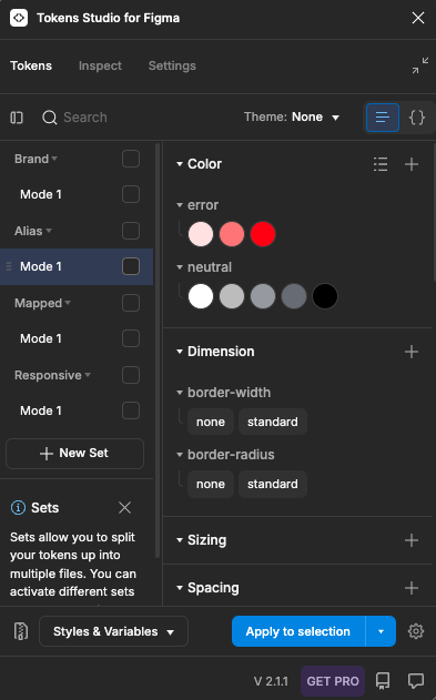
Built with foundational UX elements, interactive components, and design tokens, the ARES Shopping Suite Design System ensures a consistent and scalable experience across Snap’s AR services. It provides a seamless foundation for internal teams to integrate and deliver intuitive, accessible user experiences across all products.
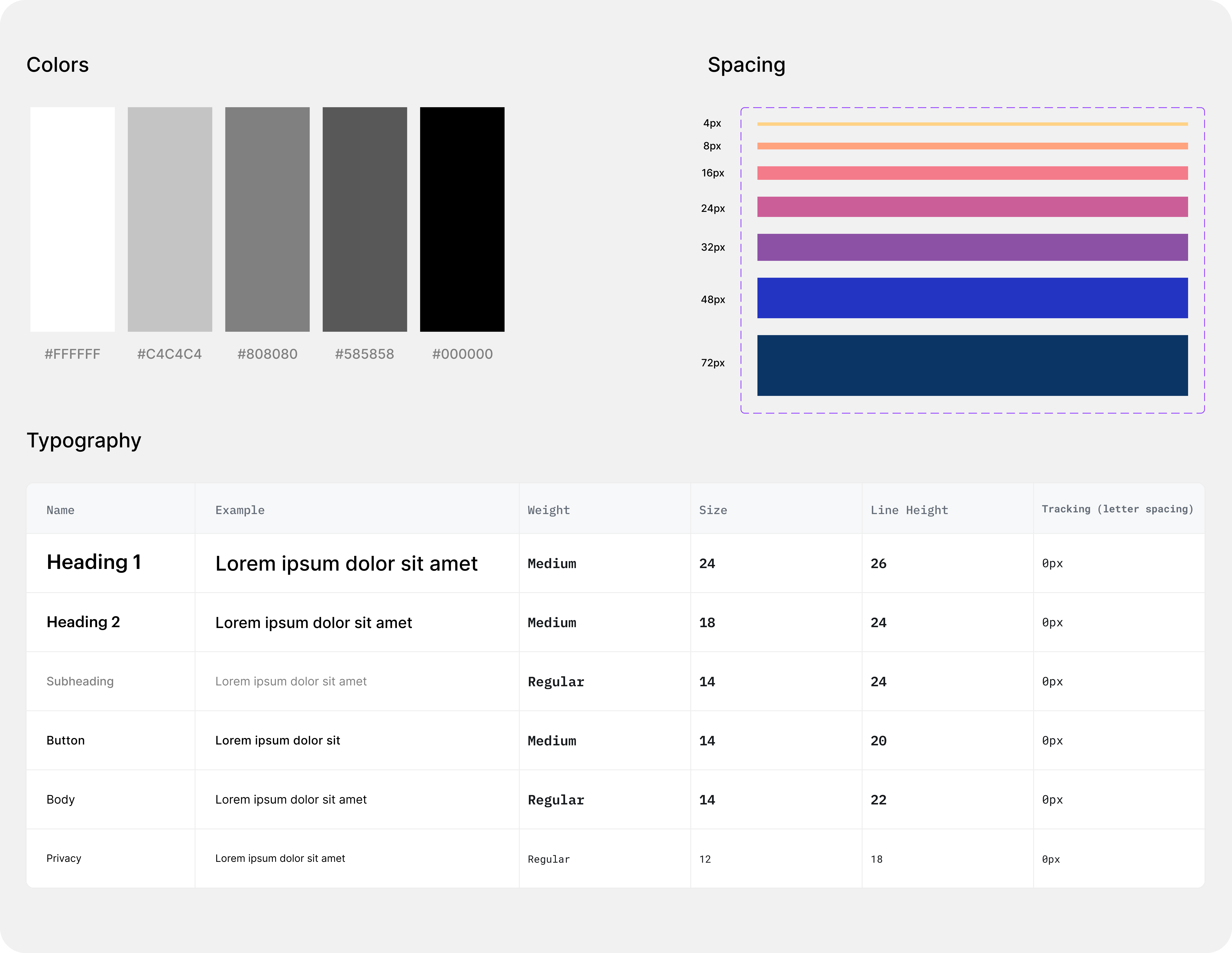
Foundations
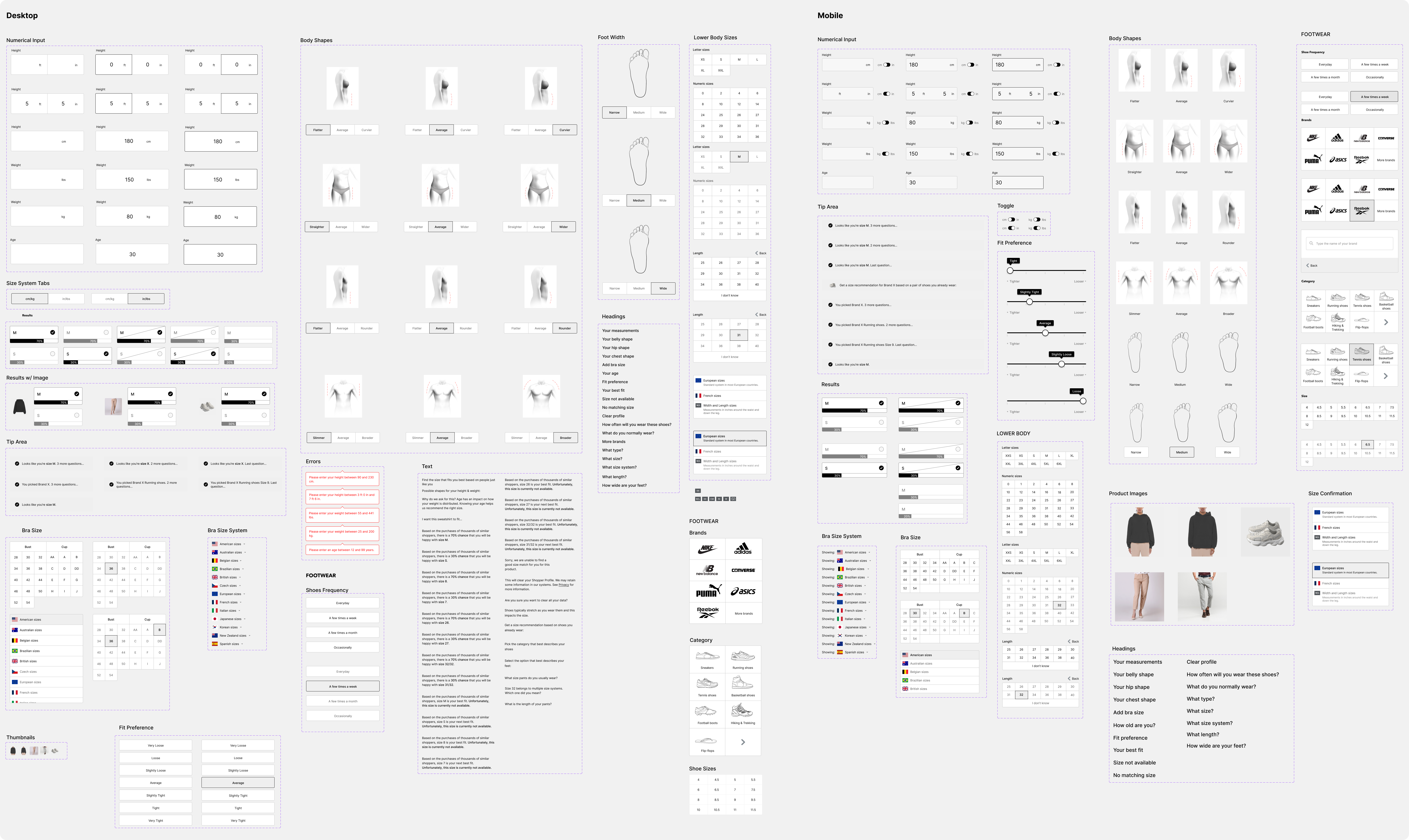
Core Components
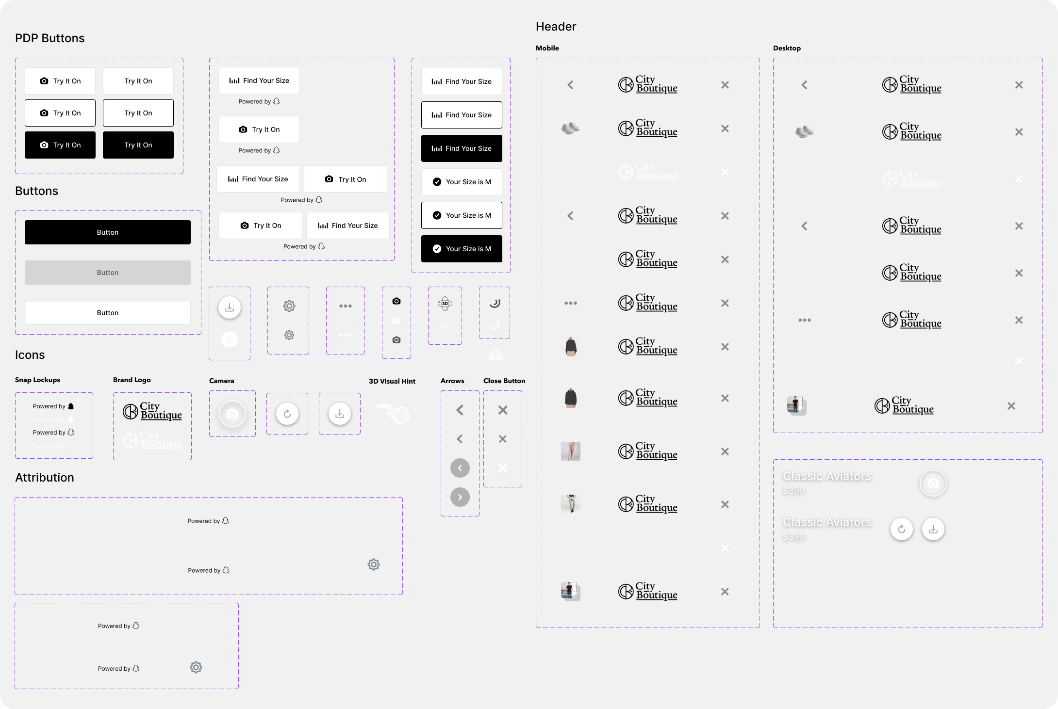
Image Try On Components
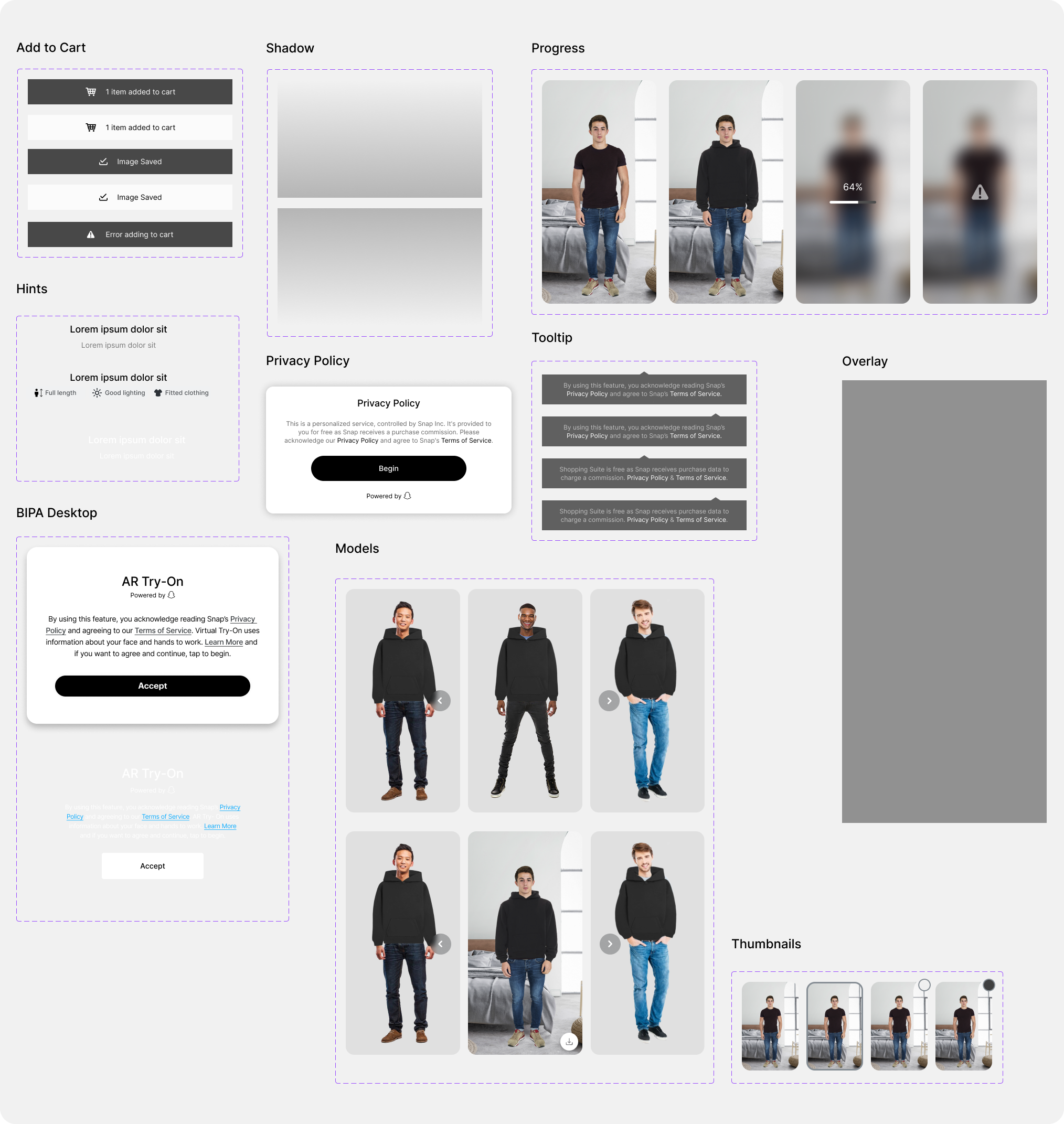
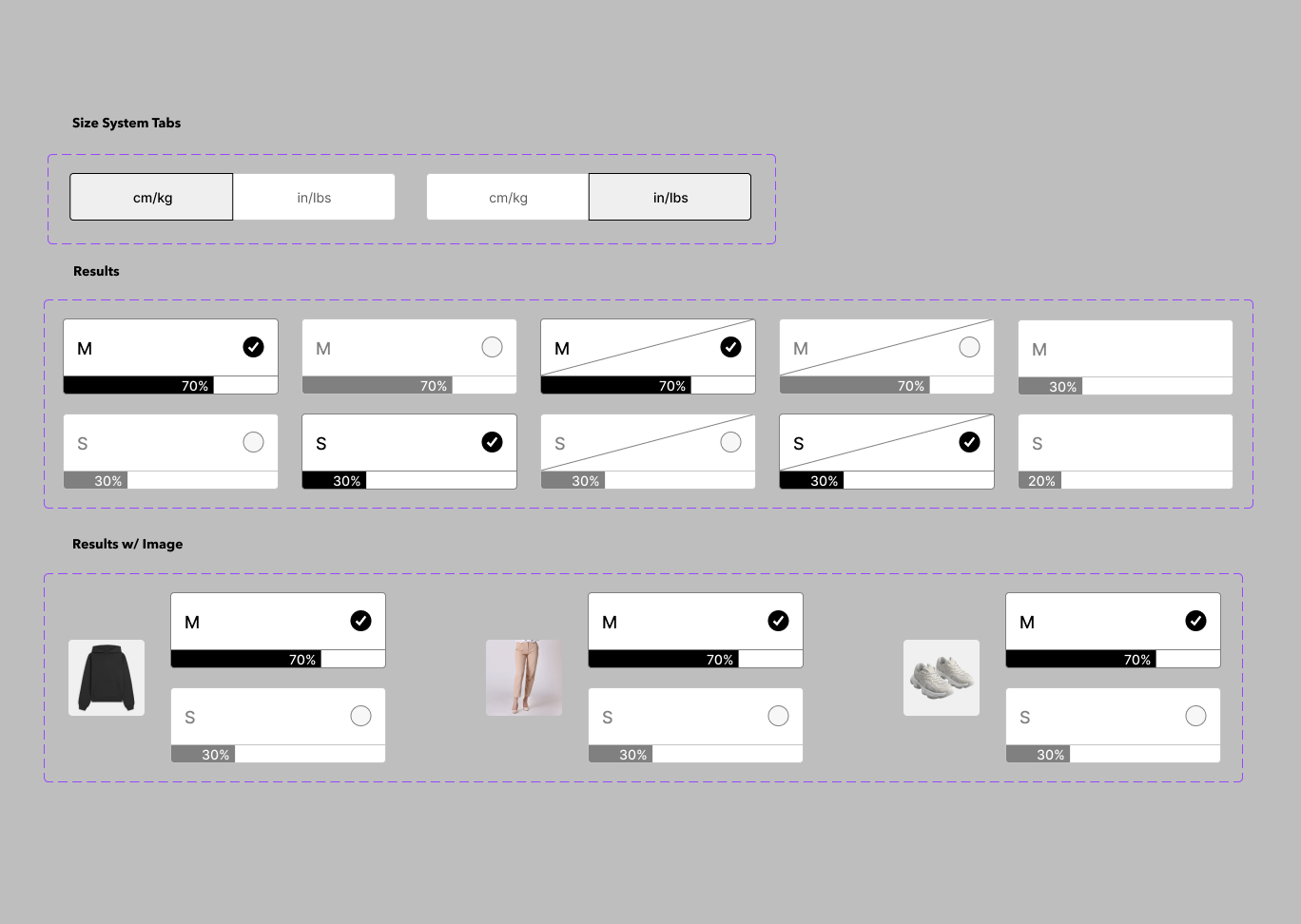
Fit Finder Components

Developer Handoff
Duration: 2 weeks
Collaborated with: The Engineering Lead and Developers to ensure clear design specifications, tokens, and assets were provided for accurate implementation
During this two-week phase, I focused on assembling detailed documentation that facilitated effective collaboration between the design and development teams. By supplying comprehensive design specifications and resources, I aimed to ensure a seamless handoff and precise execution of the Fit Finder features.
Design Specifications
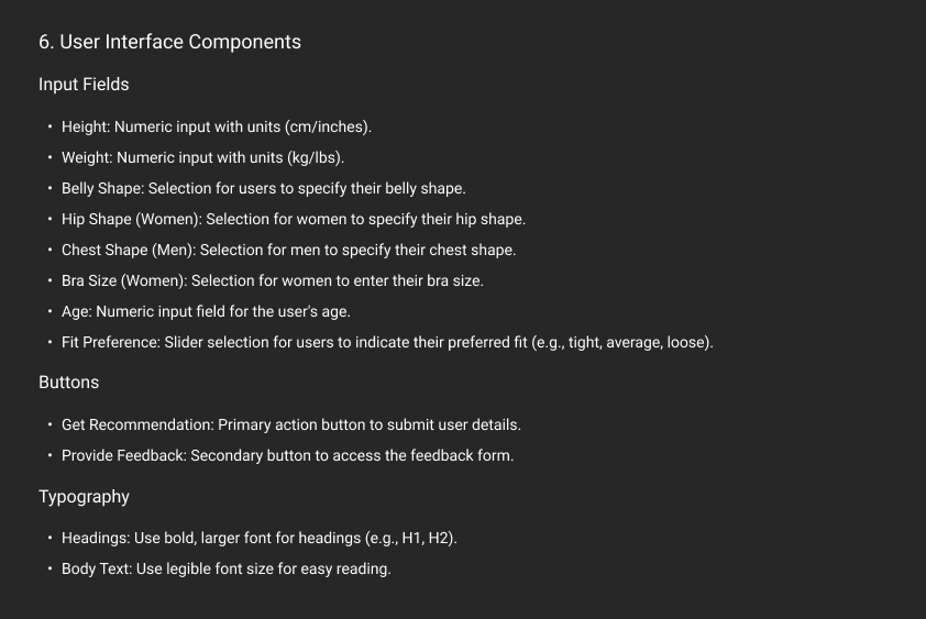
- Style Guide: Include typography, color palettes, spacing, button styles, iconography, and other design elements.
- Component Library: Provide a library of reusable components with their states (normal, hover, active, disabled).
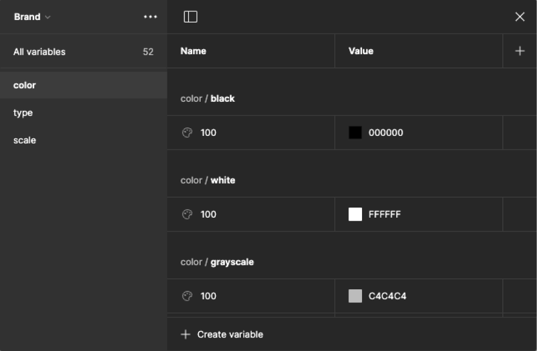
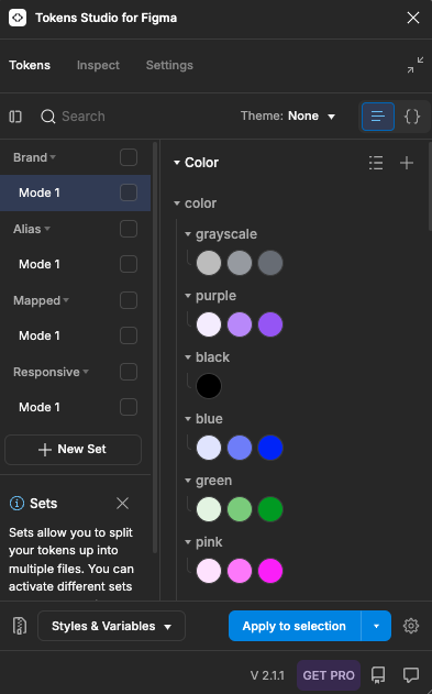
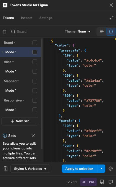
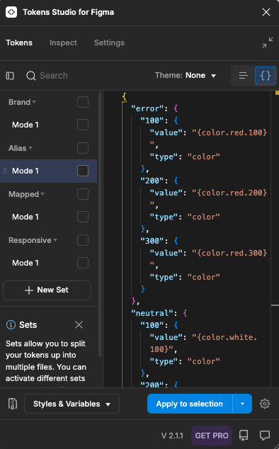
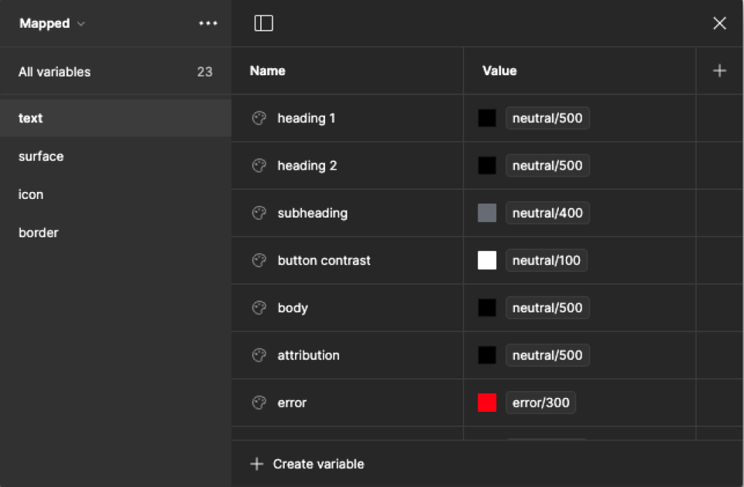
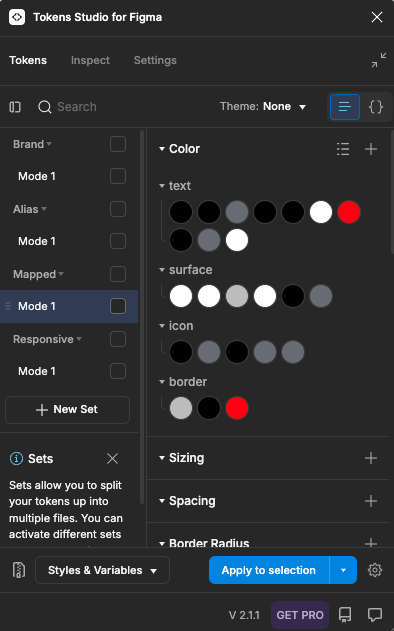
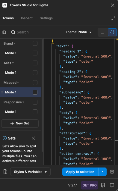
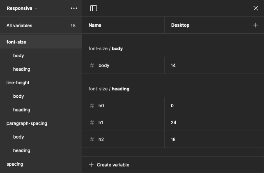
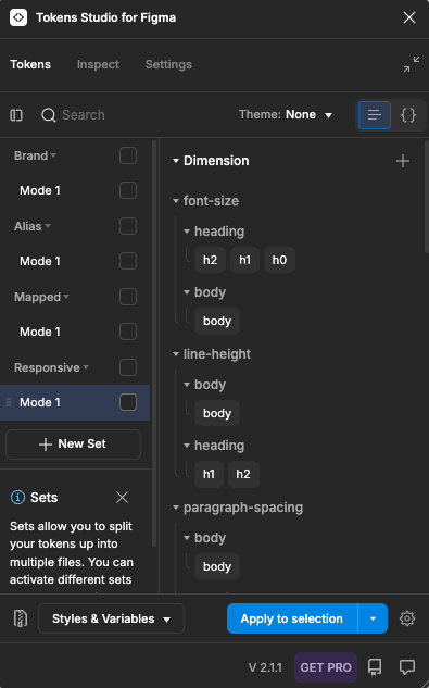
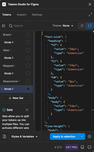
- Design Tokens: Prepare tokens for colors, typography, spacing, and UI elements in a development-friendly format (e.g., JSON, YAML).

Interactive Prototypes
- Clickable Prototypes: Provide interactive prototypes that illustrate user flows and demonstrate how components and screens should behave in context.
Documentation
- User Flows: Include diagrams that outline the user’s journey through the application, highlighting key interactions and decision points.
- Functional Requirements: Document the functional specifications, including how each feature should work and any necessary integrations with APIs or services.
- Accessibility Guidelines: Specify any accessibility considerations or standards that should be followed during development.
Annotation and Comments
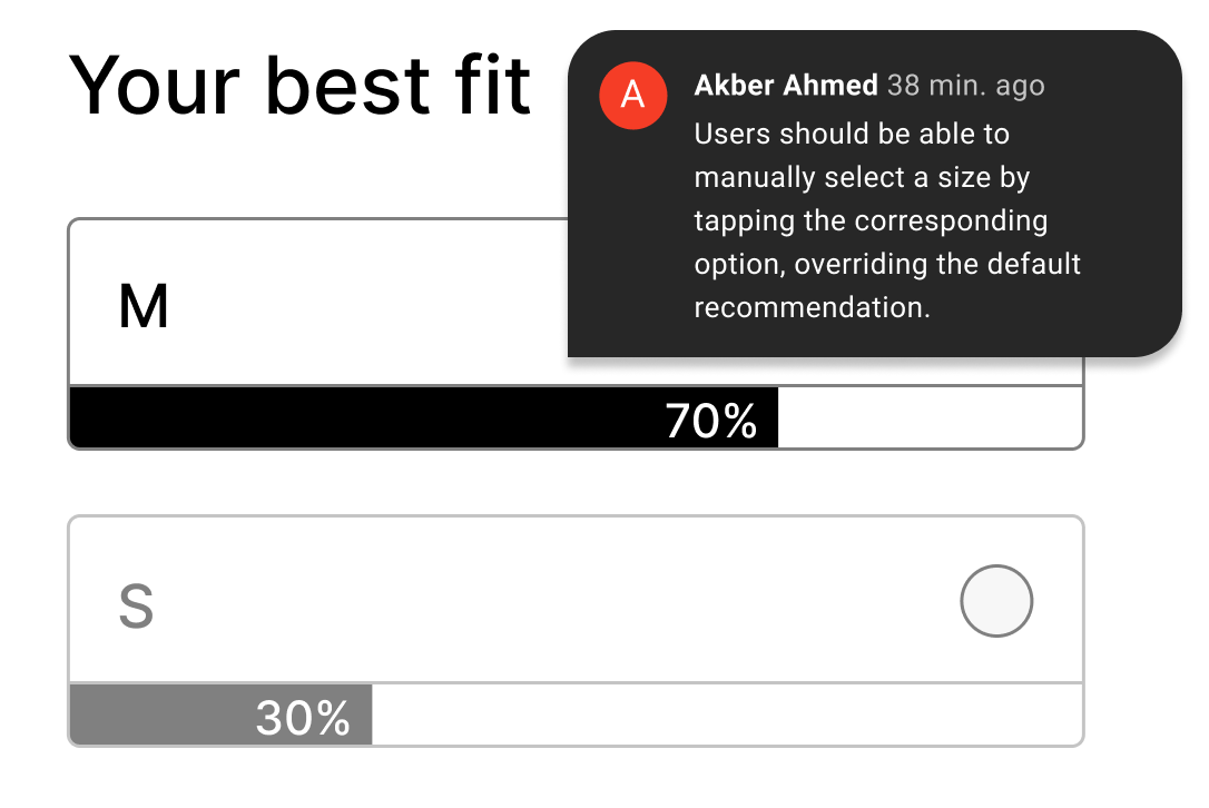
- Annotated Screens: Provide annotations within the design files to explain specific design choices, interactions, and behaviors that are not immediately apparent.
- Feedback Mechanisms: Outline how developers should communicate questions or feedback regarding the designs.
Version History
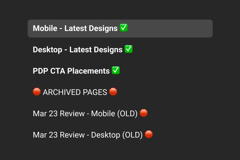
- Keep track of design iterations and ensure developers are working with the latest version of the design.

Collaboration and Support
- Scheduled Meetings: Arrange handoff meetings to walk developers through the designs, clarify requirements, and address any questions.
- Availability for Questions: Ensure that myself and other designers are available for follow-up questions during the development process.