Case study, Solo Project, 2026
Roam: Trip planning by AI, grounded in reality
Cost per plan
Time to a saved plan
Testers who finished
Commits since launch
Cost per plan measured from the server log of a real 3-day trip, Google APIs at list price. Testing: unmoderated remote study, 18 participants, directional.
The product
One designer. No engineers. Shipped.
Live MVP at roam.akberahmed.com
Enter a destination, set your dates, travellers and budget, and Roam generates a real day by day itinerary with live places, real travel times between stops, and an estimated nightly price range for where you stay. Roam is mobile-first by design, built for the phone people actually plan trips on.
Claude read the live Figma spec through MCP and built the React front end from it; the tools, the phases and the cost model are all below.
This is the live app, not a prototype. The core flow, from brief to saved plan, is complete; everything outside it is a placeholder for now. →

Discovery
Planning a trip is scattered by default
Before designing anything, I planned the Albania trip and paid attention to where it fell apart. Then I checked it against national surveys in the US and Germany.
| Where US travellers get ideas | % of travellers |
|---|---|
| Social media | 34% |
| Family and friends | 33% |
| Online travel agencies | 25% |
| Social ads | 24% |
| Influencers | 21% |
| Television | 21% |
| AI tools | 17% |
| Travel agency, in person | 16% |
| Celebrities | 13% |
| Newspapers | 12% |
US, 2025: AI sits near the bottom but grew fastest, up 30% in a year. Amadeus, 2,000 travellers.
| Where German travellers get ideas | % of travellers |
|---|---|
| Online travel portals | 64% |
| Provider websites directly | 47% |
| Friends and acquaintances | 40% |
| Travel agency, in person | 34% |
| Television | 22% |
| Travel catalogues | 17% |
| Phoning the provider | 17% |
| Travel blogs | 16% |
| Social media | 13% |
| AI tools | 3% |
Germany, 2024: portals lead, a third still visit a travel agency, AI is at 3%. Bitkom Research, 954 holidaymakers.
These surveys only measure where a trip starts, though. What happens next, when a scattered set of ideas has to become a day you can actually walk, is where my own planning came apart.
AI is on both lists, and it does not survive a real day
In the same Amadeus survey, 27% said AI had returned inaccurate information, and Amadeus's own President of Hospitality said gen AI tools are not yet ready for trip planning prime time. When InsureMyTrip tested ChatGPT, Gemini and Google's AI on a real week-long trip, the plans recommended a restaurant that does not exist and laid out days with travel times nobody could actually make.
Independent testing
"The itineraries often looked polished and logical on the surface... closer inspection revealed that both big and small details were often inaccurate."
Sara Boisvert, InsureMyTrip, reported in Forbes, 2026
That became the thesis for the whole product. Anything can generate a plan. The design problem is guaranteeing the plan is real: places that exist, prices that are close, and a day whose stops you can actually get between before dinner. Trust, not text, is the job. Four failures showed up again and again, and each one became something Roam had to answer.
Problem
The four failures Roam had to answer
01
Trip planning has no single home
A dozen tabs: a group chat, a doc nobody updates, blogs, a budget sheet. Roam turns one short brief into a full day by day plan with places, costs and a map.
02
AI bolted onto the wrong moment
Booking tools assume you already know where you are going, then bolt AI on after. Roam is AI-first from the first screen, built for "help us decide where to go."
03
Plans that look right but fall apart
Ask any chatbot and it reads well, then breaks: lunch across town, stops with no gap between them. Roam checks each plan against real travel and fixed meal times.
04
Change one stop, the plan breaks
Swap a museum for a market in most tools and the timings fall out of sync. In Roam, change any stop and the schedule recomputes itself around it automatically.







Process
48 hours, phase by phase
Seven phases, each leaning on a different tool. When a phase ran long, scope was cut, not quality.
| Hours | Tool | Phase | What happened |
|---|---|---|---|
| 0–2 | Claude | Ideation | Stress-tested the concept in a Claude session. The output was a set of decisions: three surfaces, two integrations, one hard time limit. |
| 2–4 | Figma Make | Wireframes | Nine screens from a plain-language brief. Several survived almost unchanged, which moved the real work to flow rather than layout. |
| 4–20 | Figma Agent | Hi-fi design | Agent populated the frames with real content, so the design went from placeholder boxes to something that felt like a product. |
| 20–24 | Token Studio | Design tokens to CSS | The whole visual system exported as CSS custom properties. Change a colour in Figma, it changes in the app. |
| 24–28 | Anthropic API Google Places |
Planning logic and prompt | Wired up the planning layer and wrote the system prompt, where the two-phase "ask, then generate" model was defined. Google Places sat behind it so every suggestion resolved to a real location. |
| 28–40 | Figma MCP | Design to code | Claude built each component straight from the live spec, read through MCP. This is the phase that made handoff feel solved rather than tedious. |
| 40–48 | Vercel | Build and deploy | Tight iteration on edge cases and loading states, then a production deploy in under two minutes. |
Wireframes
The structure, decided in wireframes
Hours two to four went into wireframes, not visuals. Figma Make turned a plain-language brief, a travel app with a trip form, an AI planning flow and an itinerary view, into nine rough screens. Grey boxes, real structure, enough to react to.


Click through the wireframes Figma Make generated from a plain-language brief. Several survived, almost untouched, into the final build.
Design foundation
A system before the screens
Before any screen went to high fidelity, I built the foundation everything else would inherit from: a set of tokens and a component library.
Design Tokens
Colour primitives were aliased to semantic tokens, each graded for AA or AAA contrast, so no component ever touched a raw hex. Plugged into Token Studio in Figma, the tokens export to CSS custom properties, so one colour change flows through the whole file and into the app.
Design System
On top of the tokens sat the component library: buttons, tags, cards, inputs, confidence badges and meal pills, each designed once. Figma Agent generated the variant matrix, leaving me the decisions that needed judgement. Every screen drew from that set, so one fix landed everywhere.

Tokens and components, straight to code
The same pipeline, traced through two components. The meal tag follows a colour, the trending card follows shape and elevation. Each time, the value set in the design system is the exact token the shipped CSS renders from.
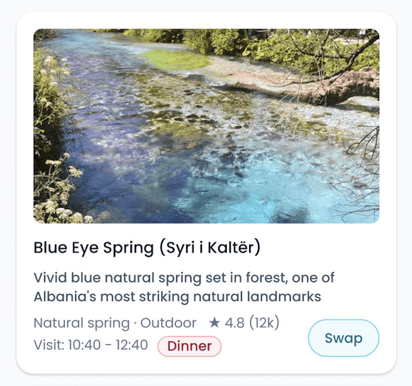
The Dinner meal tag, selected. Its colours live in the design system, not on the component.
Each colour is one named token, the only place the raw hex is written.
The component asks for the token by name. It never touches a raw colour.
The trending card, selected. Its shape, surface and shadow all come from the system, not hard-coded values.
Shape and elevation are tokens too. The shadow is one compound token carrying a whole two-layer elevation.
The card sets no pixels of its own. It reads its radius, surface and shadow from named tokens.
Design
Three acts, and the prompt behind them
Roam's interface follows a three-act structure: tell it about your trip, let it plan, then explore and refine. The brief opens with a structured form rather than a blank chat box, because most people do not want to type an essay to start a trip, and the form doubles as the model's context, so it can generate straight away. The interest chips are generated for the destination you type, so Marrakech offers souks and Bergen offers fjords, and the first set a place gets is the set everyone sees from then on.


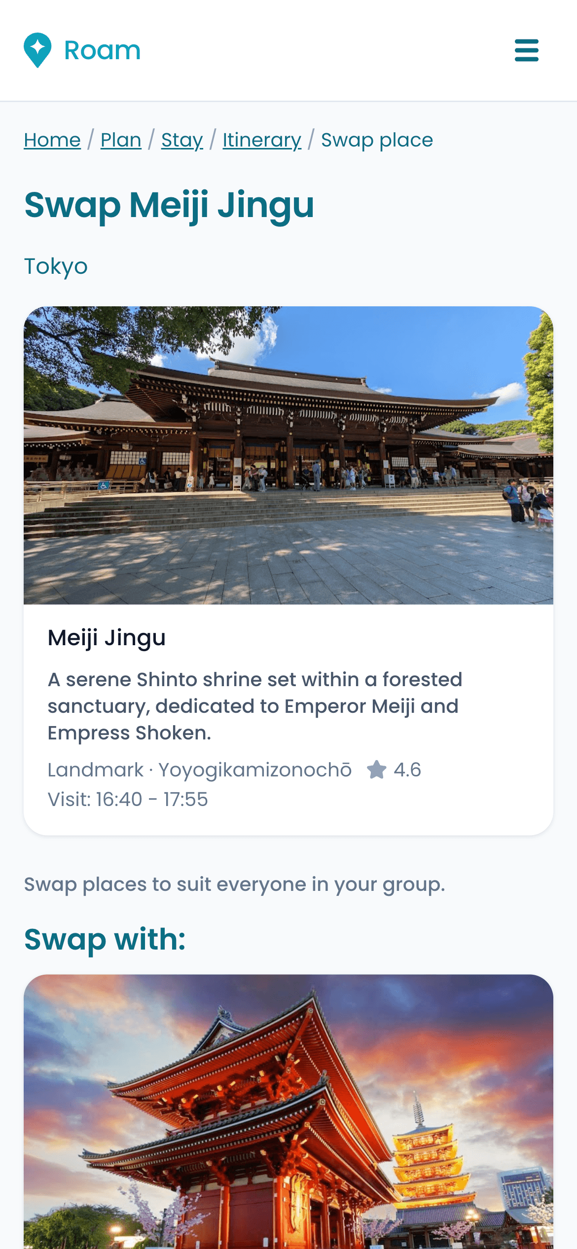

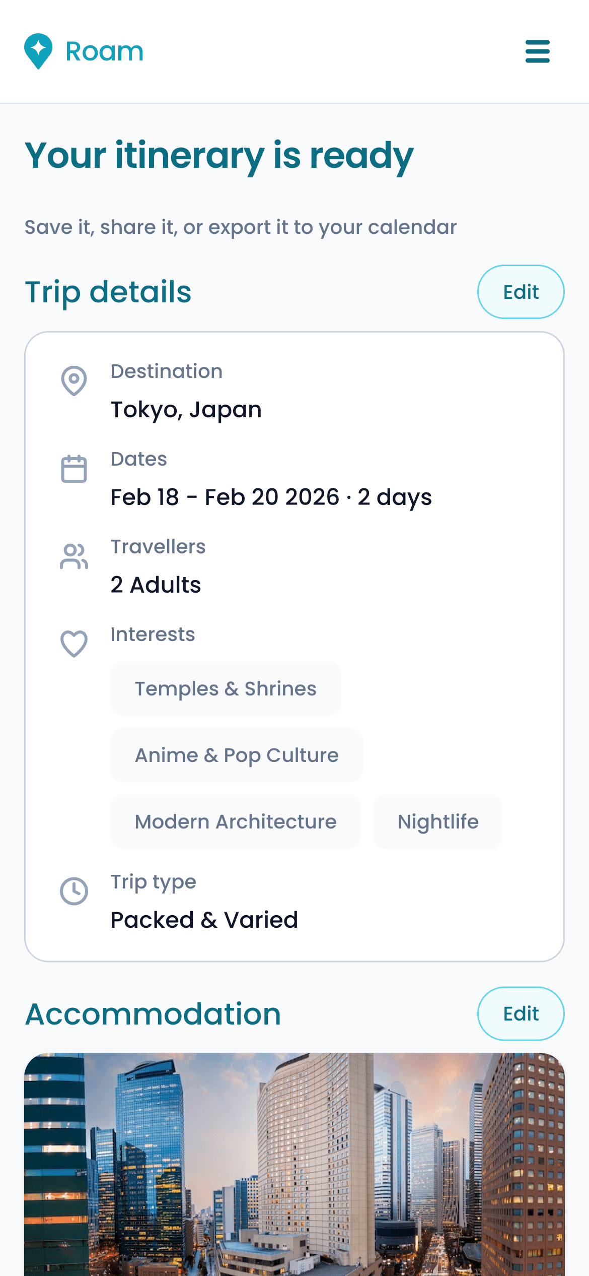
The shipped app, from a short brief to a saved plan.

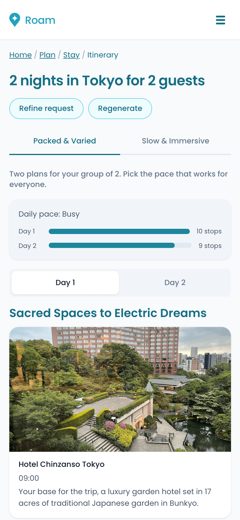
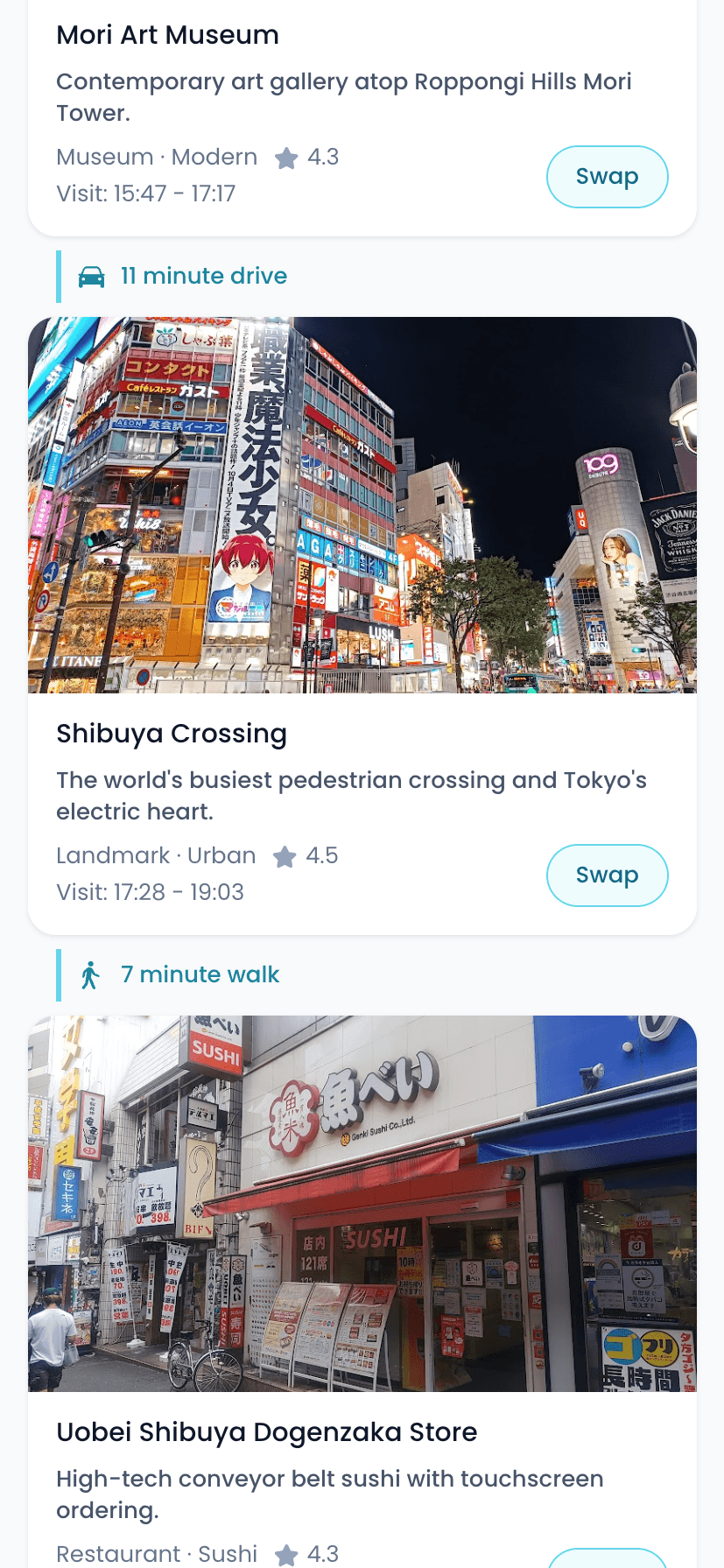
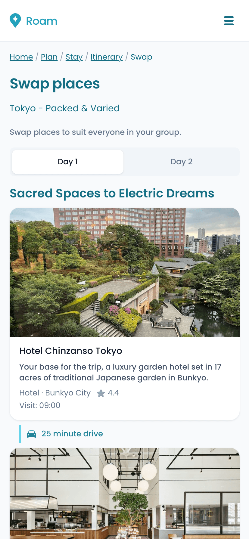


The end-to-end flow. A short brief becomes a plan, then you compare the two pacing options, open the map, or peel off to swap a stop, and any swap recomputes the itinerary around it.
Designing the prompt as much as the interface
The product's behaviour was designed in the system prompt, not in a Figma frame. Getting itineraries that felt specific and appropriately scoped took as much iteration as any screen. Four decisions changed the output most.
01
Structured output
The model returns a consistent shape: time, place, duration, reasoning note. The UI renders it predictably regardless of destination.
02
Brief as context
Every field the user fills becomes a constraint the model reasons within, rather than a question it has to ask.
03
Budget as a constraint
Economy, Standard and Luxury are injected as constraints, calibrating stays, dining and activities to the same tier.
04
Reasoning first
A one-line rationale for every stop, so the output feels advisory, not generated. It matched the core insight from my Muse project: unexplained recommendations do not build trust.
After the sprint
What only real use reveals
Roam wasn't built in a day. It was built in two, then rebuilt over eight weeks and 250+ commits. That's where it got good.

Browse the 250+ commits on GitHub

Cutting the cloud bill
About a week in, Google Cloud credits were draining far faster than the traffic justified: €134 of €263 in seven days. Almost all of it was the place search, where every lookup asked for Enterprise-tier fields. So I cut them. Then I put two back.
Review count is the only thing separating a famous restaurant from a chain branch, and opening hours the only way to know a place is open when you arrive. Without them, dinner came from the same yakiniku chain twice and the app scheduled a government building at 22:15. Right on the numbers, wrong on the product. The saving that survived is caching, so a place is never paid for twice, and static photos, so the app only costs money when someone plans a trip.

Verifying every stop is what costs money, and both pacing plans are verified, not just the one you pick.
A place already looked up costs nothing. Different dates or interests still turn up new ones.
One full 3-day generation at Google's per-call prices above the free tier. Same tier on both sides; the saving is a shared cache. Both figures are read from the server log of a real Valencia trip.
When it runs out, and when it breaks
Cheap multiplied by unlimited is still unlimited, so Roam now plans a set number of trips a day. At the limit it offers a complete example trip instead of an error, because the product is busy, not broken. A check after every deploy tells me when it genuinely is broken.
The itinerary rulebook
The biggest body of work was a set of rules the model has to obey before a plan reaches the screen, enforced in the prompt and again on the server.
| Rule | Why it exists |
|---|---|
| No idle gaps | The only space between two stops is the travel between them, checked to the minute by a script that replays a real saved plan. |
| Fixed meal times | Breakfast at 09:00, lunch at 13:30, dinner at 20:00, the same on every day. The stops flex around them; the meals do not. |
| Opening hours | Every stop is checked against its real opening hours for the whole visit. A place that would be shut is replaced; one that would close early is shortened. |
| No place twice | Dedupe on the resolved place and on the brand, not the name. This caught a Lahore plan listing the fort and a palace inside it twice. |
| Distance-first routing | Keep every stop within 15 km of your stay and reorder any day that doubles back, with Slow carrying fewer stops than Packed. |
| Balanced interests | One stop per interest a day, and a cap per trip that scales with its length, so a plan never has three casinos or two shrines. |
| Resolve or drop | A stop that fails verification is dropped rather than shown with a time and a travel leg, looking like one that checked out. |
| No numbers in prose | No travel times, distances or visit lengths in the text. Every number on a card is measured, so the prose cannot contradict it. |
When a correct rule still ships a wrong plan
A real place wearing another place's description. When a stop failed verification, the substitution replaced its name, address, photo, location, hours and category, and left the original description untouched. A members' club in Roppongi shipped described as a 24-hour ramen chain. Real place, real photo, fluent prose about a different business. Not hallucinated, mismatched, and it read perfectly.
A rule that could not fire. The check for stops scheduled at an hour they cannot keep was correct, and ran before two later passes that moved stops. Anything those passes touched shipped unexamined. A shrine went out at 21:10 and a design centre at 21:00, both hours after closing, under a rule written to prevent exactly that. It happened again one level up, in the pass that straightens a day. The second time I understood it was a shape, not an incident.
Each of those cost ~€2.29 to reproduce, because finding out meant generating a real plan against real APIs. So I built an offline harness that replays the actual scheduling code against a saved generation and reports meal times, route doubling-back, opening-hours violations and continuity to the minute. A change that used to cost a euro and a coffee now costs a second.


Reworked and fixed
Two things I got wrong early, both fixed. Unglamorous work, but it is the difference between a demo and something people can actually rely on.
| Area | What changed |
|---|---|
| Budget | Moved the budget selector to the start of the flow. Set late, it meant regenerating the whole plan; upfront, it becomes a constraint the model plans within from the first call. |
| The map | Shipped completely broken. Fixing it took a solo pass through Google Cloud: enabling Static Maps separately, attaching billing, and realigning a key that no longer matched the console. |
User testing
What fifteen travellers taught me
The sprint proved I could ship it. Testing was where I found out whether anyone would actually trust it. Eighteen people set out to plan a trip to a city of their choice, on their own phones, unguided, while the screen recorded. Fifteen got to a saved plan, and most of what they planned held. When it went wrong, most people didn't notice, and that taught me the most.
Method
Unmoderated remote usability test on real phones, via UXtweak with screen recording. Success and time on task judged from the recordings, not a completion flag.
Task
One end to end task: plan a two-night trip to a city of their choice, choose where to stay, reach a finished plan and save it. Questions before and after.
Participants
15 people who plan their own leisure trips, a convenience sample. 18 started; the 3 who didn't finish aren't counted in the findings.
Measures
Completion, Single Ease, a trust rating, UMUX-Lite, would-follow and would-use intent, plus open text coded into themes. Small n, read as directional.
Fifteen people planned a full trip on Roam and saved it, across 13 cities on five continents, without needing help from me to get there.
reached a finished, saved plan unaided, recordings confirmed
mean ease of planning the trip (range 4–7)
mean trust that places are correctly located (range 4–7)
median time from a blank screen to a saved plan
What worked
01
The core promise landed, even for sceptics
All 15 reached a plan in minutes, and most called it easy. "It's convenient to see a skeleton of a trip in just a few questions." Even the participant who dislikes itinerary apps praised "the variety of locations and activities."
02
Useful pacing plans, easily missed
Eight of fifteen noticed them, usefulness 6.6 out of 7, and one wanted a third. From the video recordings, five of those eight actually toggled between them, so most people who found the choice went on to use it.
03
People stopped to read the reasoning
On 13 of 15 recordings, participants paused on the one-line rationale for each place. The reasoning-first decision paid off: the "why this" note gets read.
04
Seeing the map made it credible
Asked why the plan felt right, one participant just said: "A map with the itinerary is shown." The map itself did the convincing, and that is the thread the next finding pulls on.
Findings at a glance
Rated on Nielsen's severity scale, a blend of how bad, how frequent and how persistent. Each finding maps to one change.
| What I found | Severity | The change it points to |
|---|---|---|
| People want a visible sense of control, not less automation.Raised by 9 of 15 | Critical | Surface the levers Roam already has: budget, timing and choosing between options. |
| The two pacing plans are useful but easy to miss.7 of 15 never noticed them | Major | Make the two plans easier to spot, and the Packed versus Slow difference visible at a glance. |
| Swapping was not recognised as the way to change the plan.4 of 15 missed it | Minor | Move the swap onto each stop so “change this” reads as an action. |
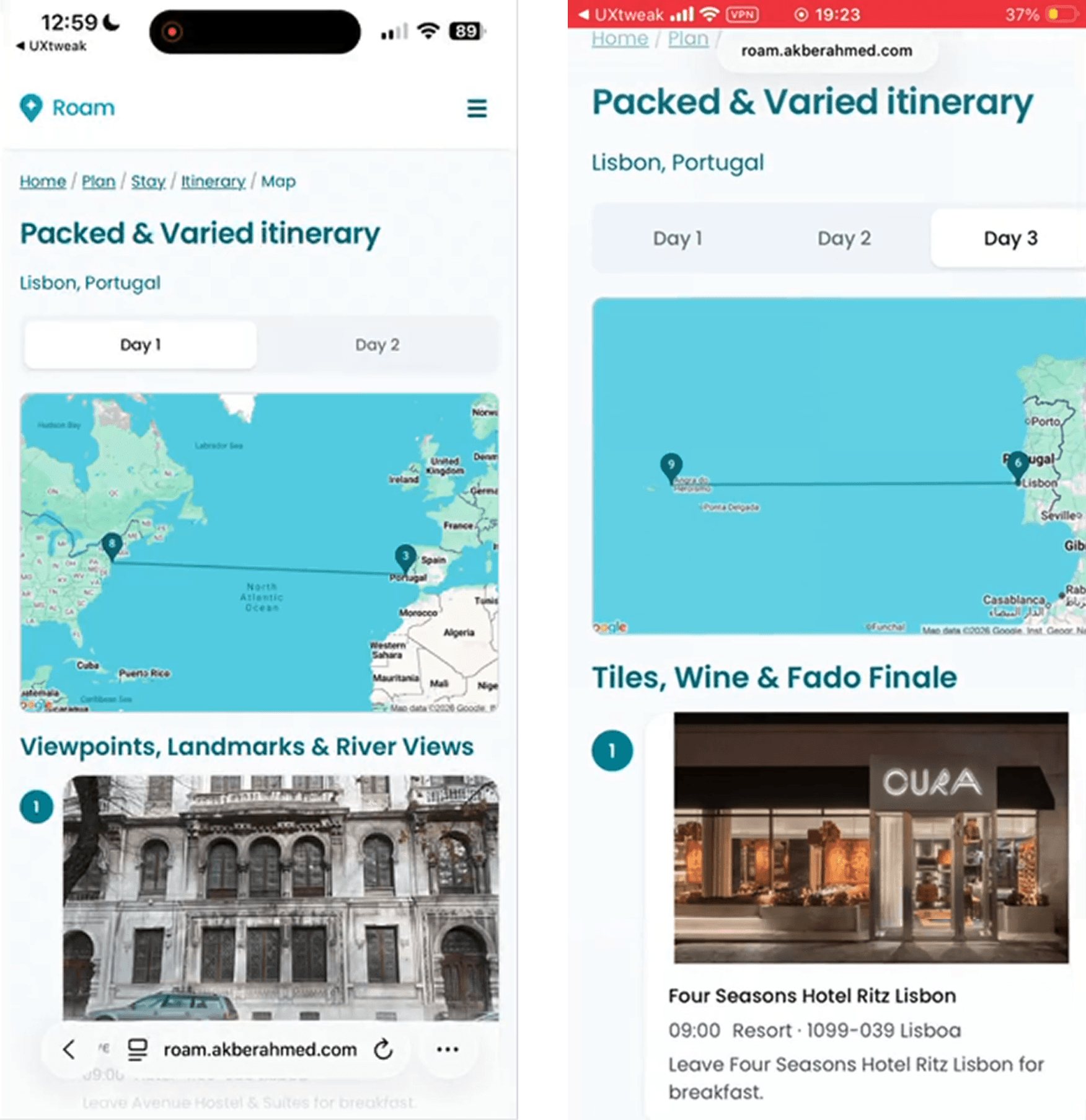
| Stops resolve to the wrong location. Three plans routed a day to another continent.3 of 15 plans · only 1 caught | Minor | Reject any stop outside the destination or more than 15 km from your accommodation, and surface the Google Places check so correctness is shown, not assumed. |
| Accommodation cards select but do not open to detail.3 tried it, 2 asked for it | Minor | Make cards expand to a detail view with photos and a price range. |
Reflection
What building and testing this taught me
Product behaviour is designed in the prompt
The decisions that changed output quality most were about how the model was instructed to behave, not layout or colour. Writing the prompt with the rigour of UX copy mattered more than any single screen.
Every number on screen is measured, not generated
Travel times come from real routes, opening hours from real listings, and the prose never contains a number it can't back up. It sounds like a technical rule. It is a trust decision, because a plausible number a reader can't check is exactly how a confident plan goes wrong.
Show the working
Roam verifies every place, but users never see that, so they trust the tone instead, and one trusted a plan that would have crossed an ocean. The verification exists. The first piece of it is now on every card, the Google rating and review count the check produced. The rest of it is the next job.
Automation and control are not opposites
Testing pushed me off my own assumption. People want the machine to do the work and to feel in charge of it. The interesting problem is agency inside automation, not one or the other.
Next steps
What comes next
The first job is the one testing ranked for me: make the two pacing plans and the swap on each stop easy to find, surface the levers people asked for, and show the rest of the verification rather than asking people to take it on trust. After that, the path is a real product, not a tidier prototype. That means a proper backend and accounts so trips persist, real booking so a saved plan becomes a trip you can take, and deeper coordination for a group planning together. That last one is where Roam started: four people, a ferry timetable and a trip to Ksamil.
A plan has to be real, it has to belong in the trip, and the people following it have to feel in charge of it. The clearest lesson came from one participant who grew suspicious of a stop far outside Lisbon. Roam's job now is to make that suspicion unnecessary.